
DFI Retail Group — Wellcome x Koizumi: Product and Food Photography
Use this as a reference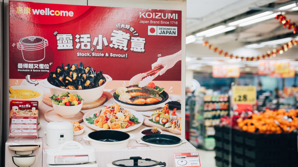
Gallery
Project Background: Japanese Design at Wellcome
To celebrate its 78th anniversary, Wellcome partnered with Koizumi, a Japanese brand with a 300-year history, on a cookware redemption promotion. Darkroom Studio was commissioned to photograph the campaign’s key visual. Displayed in Wellcome supermarkets across Hong Kong, the image formed the centrepiece of the campaign, communicating the quality and practicality of the Japanese cookware at a glance.
Visual Approach: Bringing Cookware and Food Together
For the “Stack, Sizzle & Savour” campaign, our photography combined a clear presentation of product features with appetising food imagery:
Product Texture: Careful lighting brought out the matt, off-white finish and clean lines of Koizumi products, including rice cookers and non-stick pans with detachable handles. The treatment reflected their “Designed in Japan” positioning.
Appetising Food Styling: We styled colourful dishes, including mussels, sushi, grilled fish and pasta, directly in the cookware. This demonstrated the convenience of serving straight from the pan, while the vivid colours made the food appealing and invited shoppers to consider the redemption offer.
A Celebratory Composition: A generous banquet-style table arrangement, set against Wellcome’s recognisable red background, reflected the supermarket’s 78th-anniversary celebrations and the pleasure of flexible cooking and sharing food.
In Use: A Visual Focus in Supermarkets Across Hong Kong
The key visual was displayed prominently throughout Wellcome’s store network. Clear product presentation and appetising food styling were designed to engage household shoppers and young families, giving the stamp redemption campaign a recognisable visual focus.
About the DFI Wellcome x KOIZUMI “Stack, Sizzle & Savour” Key Visual Photography
Partner Brand: KOIZUMI (Japan Brand Since 1716)
Year: 2023
Q&A
What was the visual focus of Wellcome’s collaboration with Japanese brand KOIZUMI?+
The key visual was created for Wellcome’s “Stack, Sizzle & Savour!” stamp redemption campaign. The photography focused on the cookware’s minimal Japanese aesthetic and practicality. Darkroom Studio placed the ivory-coloured appliances in a carefully styled setting with a warm red background, reflecting Wellcome’s brand colour and the products’ “Designed in Japan” identity.
How did Darkroom Studio use food styling photography to make the cookware more appealing?+
Cookware photographed alone can feel impersonal. To bring the “Sizzle & Savour” theme to life, we used carefully considered food styling. The images showed prepared dishes, including mussels, pan-fried fish and sushi, in the cookware itself. Rich colours and the inviting appearance of freshly cooked food helped shoppers imagine the meals they could prepare, supporting interest in the redemption promotion.
How should a key visual be designed and photographed for a busy supermarket environment?+
Supermarkets contain a great deal of competing information, so promotional materials need strong visual impact. The project photographs show the images used on in-store hanging banners and point-of-sale displays. Clear, uncluttered compositions keep the products and food legible from a distance and direct attention towards the stamp redemption message in busy shopping aisles.
- Client
- DFI Retail Group (Wellcome)
- Project
- Wellcome 78th Anniversary - Koizumi Stamp Redemption Campaign
- Services
- Product photography, food styling and key visual photography
- Date
- 2024-02-08


